Lawyer PPC Mistakes: 7 Expert Ways Your Firm Is Bleeding Budget
How much does Google Ads cost for lawyers in 2026? View CPC & CPL benchmarks for Personal Injury, Family Law, & more. Slash costs with our 2026 PPC audit.


Advanced digital marketing requires us to go beyond what everyone else is doing and approach from new angles. One of the ways to stand out in your SEM analysis & performance is through advanced techniques like regression analysis. Regression is actually a form of basic Machine Learning and a relatively simple mathematical application. This type of analysis can help you make better predictions from your data, beyond educated guessing.
Regression might sound scary, but it’s actually not that advanced in the world of mathematics. For anyone who’s passed year 10 maths, you have probably already worked with regression formula already. We’re going to look at using regression in your Google Ads to predict the conversion volume you can achieve by adjusting campaign spends. Building the model & applying it is far easier than you would think!
A regression model is an algorithm that tries to best fit itself to the presented data. In essence, it is a line of best fit. It can be linear, as a straight line through the data, or non-linear, like an exponential curve, which curves upwards. By fitting a curve to the data, you can then make predictions to explain the relationship between one dependent variable and one or more independent variables.
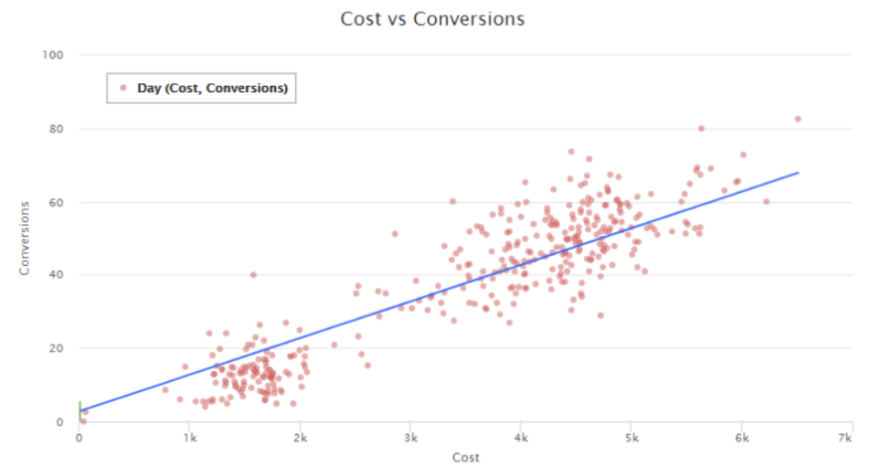
The plot below shows a simple linear regression between an independent variable ‘cost’ (daily spend on Google Ads) on the x-axis and a dependent variable ‘conversions’ (daily conversion volume on google ads) on the y-axis. We have fit a linear regression line (blue). We can now say that at $3k on the axis, that point on the regression line would match up to 35 Conversions. So, based on the regression model fitted to the data, if we spend $3k, we are predicted to receive 35 conversions.
I’ve been running many of these regression models and I’ll share what I’ve found to be true, which will give you a headstart in where to start looking
Multiple regression is where a number of independent variables are used (rather than just one, as in the example above), to predict one dependent variable. With Google Ads I’ve found that there is always one independent variable that is the strongest predictor of conversions. You could probably have guessed which one it is already.
When running Machine Learning (ML) model’s on daily labelled training data to predict whether certain features would lead to a conversion, we continually found that, all other things being equal, campaign spend is the strongest predictor of conversion volume.
The following table shows the ‘Root Mean Squared Error’ (RMSE) for different ML Models
|
Decision Tree |
K Nearest Neighbours |
Linear Regression |
Random Forest |
Support Vector Regression |
|
|
RMSE all features |
1.51 |
1.61 |
1.77 |
1.24 |
1.84 |
|
RMSE Without ‘Cost’ |
2.98 |
1.50 |
3.12 |
2.18 |
1.83 |
We ran 5 different machine learning algorithms: Decision Tree, K Nearest Neighbours, Linear Regression, Random Forest & Support Vector Regression. In most cases, removing ‘cost’ as a feature in the data set, increased the error value by more then removing any other feature. This means that the model became less accurate at predicting the correct outcome.
We can also analyse the feature importance used by the random forest (the best model). It’s clear that cost is the key feature the algorithm is using to determine its results:
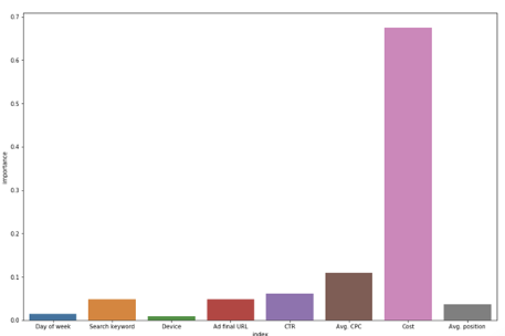
This shouldn’t come as too much of a surprise – the more you spend, the more likely you will receive sales. Using cost as a predictor for sales is a great place to start your regression analysis.
1 RMSE measures how far the model’s predictions deviate from the training data. A lower value means a more accurate fit.
2 All features: day of week, keyword, CTR, CPC, device, final URL (landing page), ad position, and cost.
Here we’ll show you how to actually build a regression model with ‘daily cost’ as the independent variable and ‘daily conversions’ as the dependent variable. We’re going to do this in 5 easy steps.l
Note that this will only work with a Google Ads account that has conversion data in it.
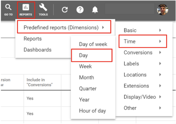
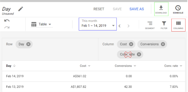
Within Google Ads, navigate to Reports >> Predefined Reports >> Time >> Day
Once in the report (screenshot below), select the ‘columns’ button (red box), then remove all columns except ‘Cost’ & ‘Conversions’. Then select a date going back one year from today (blue box). lastly, download the report as an ‘excel .csv’ file (green box).
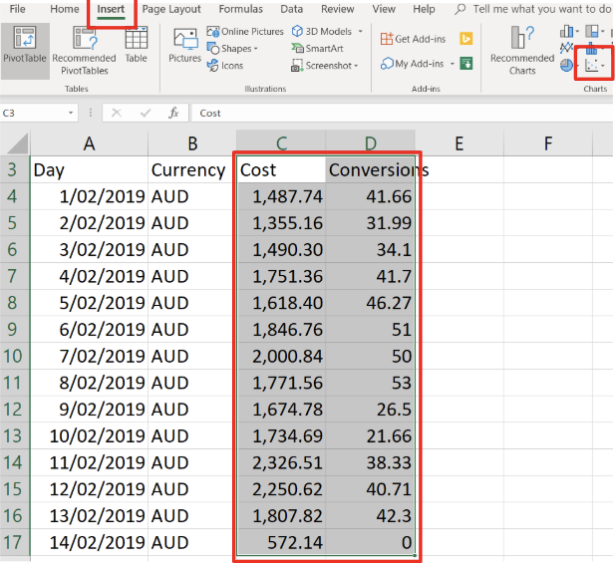
Open the excel file and select columns that contain only the ‘cost’ & ‘conversions’ data. In the example below, cells C3:D17. Then in the menu bar select ‘Insert’ >> ‘scatter graph’
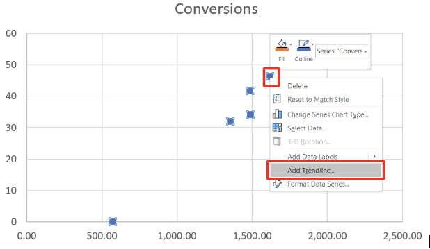
We’ve now got a beautiful scatter graph portraying ‘cost’ & ‘Conversions’. Generate a regression line by right-clicking on any of the data points and selecting ‘add trendline’
In the menu on the right hand side you are now able to select different regression options (red box). Select the checkbox ‘Display R-squared value on chart’ (pink box). In a general sense, the higher the r-squared, the better the fit of the line. As you cycle through different regression lines you can view which has the highest r-squared value. You can also decide visually which appears to fit best. Next, add the regression formula for the fit you have chosen (green box). We will use this formula to make predictions.
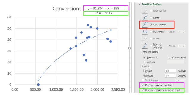
The regression line that we have just created is extremely useful. Even from from a visual perspective you are now able to visualise what your expected daily conversions will be at any point of daily cost.
Although this can be done visually, using the regression formula is more accurate and you can also extend the predictions off the graph. In the example below that I have plotted (with a larger account), the regression equation is given as y = 28.782*ln(x) – 190.36
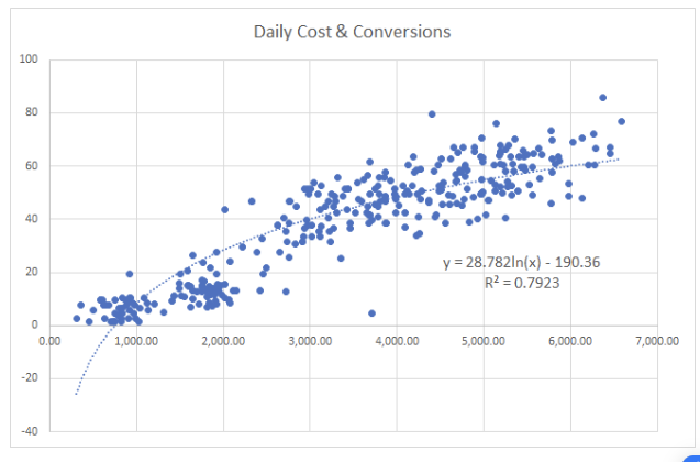
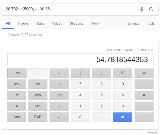
In the equation y represents conversions, and x represents ‘cost’. To predict y for any given x, we replace x with a real number. Let’s assume a cost of $5,000. We say y = 28.782*ln(5,000) – 190.36. Using a calculator, it comes out to 54 conversions per day.
Now the real power here comes when we extend this calculation beyond the graph to where spend has not been before. The data points on the graph show the highest spend ever performed per day was under $7,000. If we replace x with 10k, (a predicted spend of $10,000 per day), I can get an estimate using the formula, of 74.7 conversions per day.
Graphing the ‘cost’ and ‘conversions’ together is extremely powerful for being able to predict conversions at different spends. But in reality, often we’re more interested in minimising CPA or predicting conversions at a certain CPA. We can similarly graph CPA against conversions to better understand this.
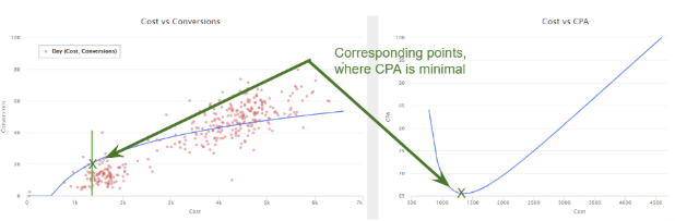
From the CPA chart on the right we identify a minimal point where CPA is lowest on the cost dimension, this is the bottom of the ‘U’ shape. This point also corresponds on the left graph of ‘cost vs conversions’.
Using this methodology we can now identify the lowest CPA potential, at what cost this occurs and then also predict how many conversions we would receive at that point. The same can be done for any point on the CPA line.
It’s critical to mention that regression uses historical data only. All of the costs and conversion data is based on what has happened in the past. Therefore if you expect your performance to improve and conversions to increase in the future, this will not be taken into account in these models. To adjust for this, taking more recent data only, such as 6 months back or 3 months back could be a better option. Similarly, you can remove or include ‘days’, during sales periods that may or may not be relevant, in order not to skew the data.
Using this methodology we have been able to achieve 3 key outcomes with clients:
Consider that many business are interested in revenue & ROI, rather then conversions and CPA. The same techniques can be used to predict revenue as well as options to maximise ROI (we look for maximal points rather than minimal). I’m currently building an PPC optimisation tool to automate this graphing and prediction process. The tool will also take this one step further by being able to solve for the optimal solution using a solver function. Stay tuned for its release.
Supporting documents
How much does Google Ads cost for lawyers in 2026? View CPC & CPL benchmarks for Personal Injury, Family Law, & more. Slash costs with our 2026 PPC audit.

How much does Google Ads cost for lawyers in 2026? View CPC & CPL benchmarks for Personal Injury, Family Law, & more. Slash costs with our 2026 PPC audit.

How much does Google Ads cost for lawyers in 2026? View CPC & CPL benchmarks for Personal Injury, Family Law, & more. Slash costs with our 2026 PPC audit.